When using hoverTooltip, there’s no built-in way to add a class to the cm-tooltip wrapper around your actual created DOM element.
create(){
  const dom = document.createElement('div');
  dom.className = 'MY_CUSTOM_CLASS';
  return dom;
}
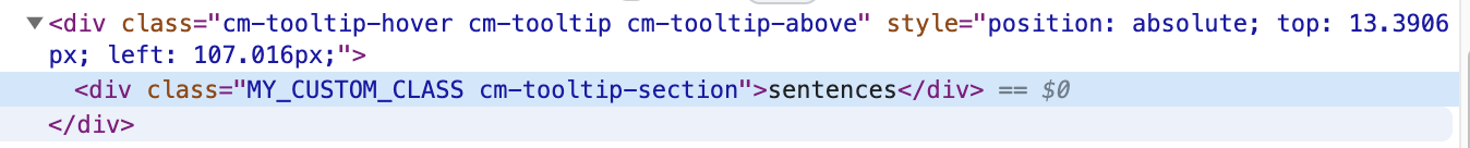
results in a DOM like this, where your actual DOM element is wrapped inside the .cm-tooltip:
You can target .cm-tooltip-hover for custom styles (like to remove the background or border), however that will affect all hover tooltips.
The only way I’ve found to add a class to the actual tooltip wrapper is like this:
    create(view) {
      let dom = document.createElement("div");
      dom.className = 'MY_CUSTOM_CLASS';
      dom.textContent = text.slice(start - from, end - from);
      return {
        dom,
        mount() {
          // Add class to the parent wrapper on mount
          dom.parentElement.classList.add('TOOLTIP_WRAPPER');
        }
      }
    }
This approach works, but feels wrong and prone to problems. Ideally there could be an option in hoverTooltip to add a class to the wrapper, much like autocompletion.config.tooltipClass
Related: